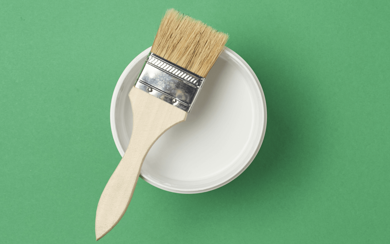
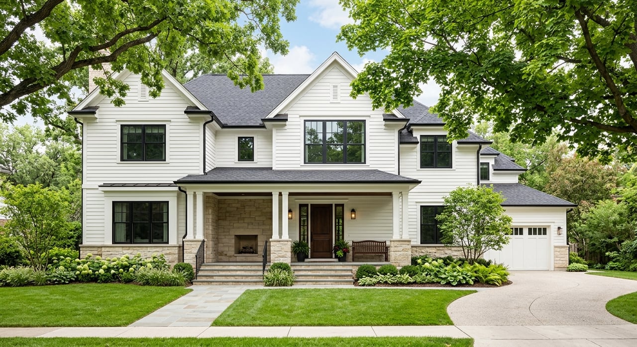
When it comes to interior design, one of the most powerful tools at your disposal is color. The right paint tone can transform a room, influencing not only its aesthetic appeal but also the way it feels. However, choosing the perfect paint color for every room in your home is more than just picking your favorite shade—it’s about understanding the science of color and how different hues affect mood, perception, and space. This guide will explore how to harness the psychology of color to create a harmonious and balanced home, offering tips for selecting paint tones that suit both the function and feeling of each room.
Understanding the Psychology of Color
Before diving into specific paint suggestions for each room, it’s essential to understand the psychology behind different colors. Color has a profound effect on our emotions and behaviors, which is why selecting the right hue is key to setting the mood of a space.
-
Warm Colors: These include reds, oranges, and yellows, which are often associated with energy, warmth, and positivity. These shades are great for spaces where you want to encourage activity and conversation, such as living rooms or kitchens.
-
Cool Colors: Blues, greens, and purples are calming and tranquil, making them ideal for spaces intended for relaxation, such as bedrooms and bathrooms.
-
Neutral Colors: White, beige, gray, and taupe are versatile, creating a sense of simplicity and balance. These shades work well in any room, especially when paired with bolder accent colors.
-
Earth Tones: Inspired by nature, shades like brown, terracotta, and olive green offer a grounding effect and are perfect for creating a cozy and welcoming atmosphere.
By understanding how colors influence mood, you can better match your paint choices to the purpose of each room, ensuring your home feels cohesive and well-thought-out.
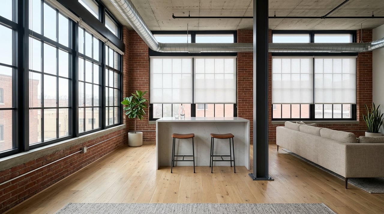
Choosing Paint Colors for Living Spaces
The living room is often the heart of the home, where family and friends gather for relaxation, conversation, and entertainment. Because of its multifunctional nature, it’s important to choose a paint color that feels inviting and flexible.
-
Warm Neutrals: Shades like beige, taupe, or warm grays offer a subtle backdrop that can be easily adapted to any style of furniture or décor. These tones are perfect for creating a cozy, welcoming atmosphere without overwhelming the space.
-
Soft Blues or Greens: For a more serene feel, soft cool tones such as pale blues or sage greens can make the living room feel calm and relaxed. These shades pair well with both traditional and modern designs and work especially well if the room gets plenty of natural light.
-
Bold Accent Walls: If you want to make a statement, consider painting one wall in a bolder color like a rich terracotta, navy, or emerald green. Accent walls can add depth and interest without overpowering the room, allowing you to create a focal point.
Selecting the Right Color for the Kitchen
Kitchens are often the most active spaces in a home, where cooking, eating, and socializing take place. As a result, the kitchen benefits from colors that are both energizing and inviting.
-
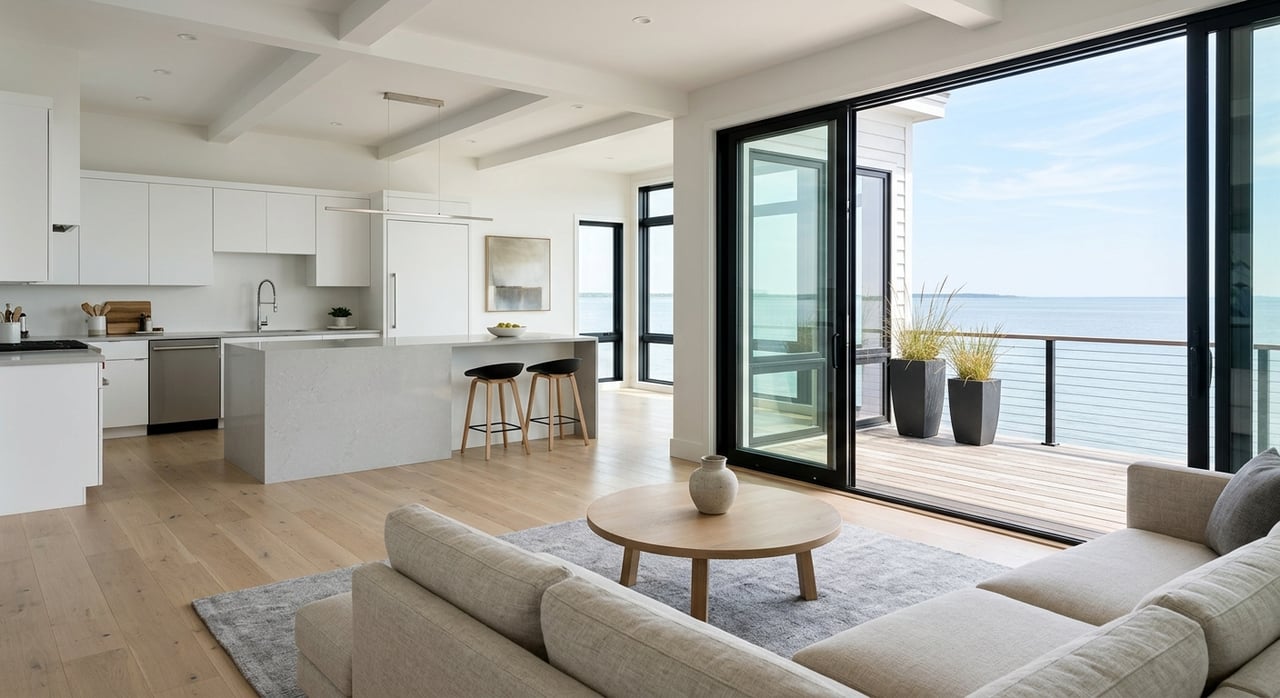
Bright Whites: Crisp white walls can make a kitchen feel clean and bright, offering a perfect canvas for colorful accents like cabinets, backsplashes, or countertops. White also reflects light well, making smaller kitchens feel more spacious.
-
Sunny Yellows: Yellow is a classic kitchen color, evoking warmth, optimism, and energy. Soft shades of yellow can brighten the space, making it feel cheerful and lively, especially in the morning light.
-
Deep Greens or Blues: For a more sophisticated look, consider earthy greens or deep blues. These colors create a rich, grounded atmosphere and pair beautifully with natural wood or metal finishes. Darker tones can also add a sense of luxury and depth to larger kitchens.
Creating a Calm and Cozy Bedroom
The bedroom should be a sanctuary, a space designed for rest, relaxation, and rejuvenation. The right color can help create a calming atmosphere conducive to sleep and unwinding after a long day.
-
Soft Blues and Grays: Cool tones like light blue, soft gray, or lavender are perfect for bedrooms, as they evoke a sense of calm and tranquility. These colors help reduce stress and create a peaceful environment, making it easier to fall asleep.
-
Warm Beige or Taupe: For a more neutral option, warm beiges and taupes offer a soothing backdrop while still providing warmth and comfort. These tones are ideal for creating a serene yet sophisticated space, especially when layered with plush fabrics and natural textures.
-
Moody Dark Shades: If you prefer a cozier, more intimate feel, consider deeper hues like charcoal gray, navy blue, or forest green. Darker tones can make a bedroom feel cocoon-like, perfect for those who want a truly restful retreat. Pair with soft, light bedding to keep the room balanced.
Best Colors for Bathrooms
Bathrooms are personal spaces where you start and end your day, so it’s important to choose colors that promote both relaxation and freshness.
-
Crisp Whites: White is a popular choice for bathrooms because it exudes cleanliness and purity. A bright white bathroom feels fresh and airy, especially when complemented by natural light and reflective surfaces like mirrors and tiles.
-
Soft Blues and Greens: Like in bedrooms, soft cool tones are perfect for bathrooms, promoting a sense of calm and serenity. Light blue or aqua shades create a spa-like ambiance, making the bathroom feel like a personal retreat.
-
Warm Neutrals: If you prefer a more grounded look, opt for warm neutrals like light beige, cream, or even a soft blush. These tones add warmth without feeling too bold, and they can create a harmonious atmosphere, especially when paired with natural stone or wood accents.
Choosing Colors for a Productive Home Office
With more people working from home, creating a productive and inspiring home office is more important than ever. The right color can help boost focus, creativity, and efficiency in your workspace.
-
Soft Grays or Greens: Neutral tones like gray or sage green are excellent choices for a home office, as they are calming yet professional. These shades create a balanced backdrop that encourages focus without being distracting.
-
Energetic Yellows or Oranges: If you want a more stimulating environment, consider adding touches of yellow or orange. These warm, energetic hues promote creativity and can help keep you motivated during long work hours.
-
Muted Blues: For a more tranquil office space, muted blues are a great choice. Blue is known to enhance productivity and focus, making it ideal for a workspace where concentration is key.
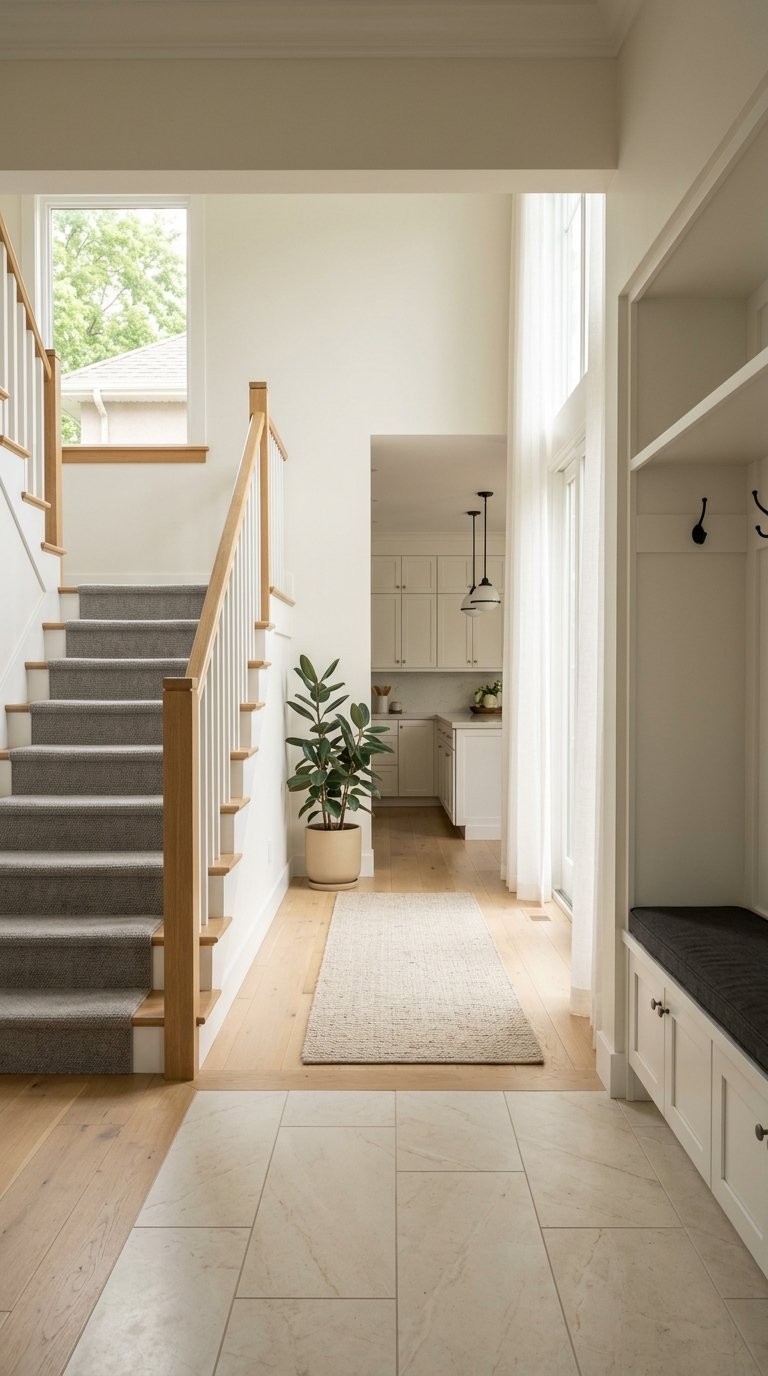
Harmonizing Color Choices Throughout the Home
While each room can have its own distinct color scheme, it’s important to ensure that the colors flow harmoniously from one space to the next. This doesn’t mean every room has to be painted the same color, but there should be a sense of continuity throughout the home.
-
Create a Cohesive Palette: Choose a few main colors and carry them throughout the house in different ways. For example, if you use a soft gray in the living room, consider carrying it into the hallway or kitchen as an accent color. This helps create a sense of unity and balance.
-
Use Color to Define Spaces: In open-concept homes, you can use different colors to define specific areas without the need for walls. For example, a soft beige in the living room might transition into a calming blue in the dining area, creating visual separation without breaking the flow.
-
Balance Bold and Neutral: If you use bold colors in one room, balance them with more neutral tones in adjacent spaces. This prevents the home from feeling overwhelming and ensures that each room feels intentional and thoughtfully designed.
Choosing the right paint color for each room in your home is both an art and a science. By understanding how different hues affect mood and perception, you can create spaces that not only look beautiful but also feel comfortable and inviting. Whether you’re aiming for a vibrant, energetic kitchen or a calm, restful bedroom, the key is to select colors that complement the function and ambiance of each space.
Through careful planning and thoughtful color choices, you can transform your home into a harmonious, well-designed retreat where every room serves its purpose while maintaining a cohesive, stylish flow.
Giorgios Karayannis is a dedicated real estate professional with extensive experience in the Chicago and Northwest Indiana markets. Born and raised in Michigan City, Indiana, he possesses a profound understanding of local real estate dynamics. Licensed in both Indiana and Illinois, Giorgios is committed to helping clients navigate their homeownership journeys with expertise and passion. Whether you're interested in vibrant city living or tranquil lake life, Giorgios is your go-to expert for all real estate needs. Connect with Giorgios Karayannis today and take a step closer to finding your dream home!